PRINT / LIVE STREAM MEDIA
CLIENT Team ODZ
DATE March 2021
The Situation
Team ODZ is a cycling club that rides and races mostly on the multiplayer platform Zwift (rarely also on RGT, Sol and Veloton). While they almost exclusively meet online, they actually also host a yearly club cycling camp.
Since its inception in 2015, the visual brand identity has been dominated by the use of electric blue and orange stripes, among other elements, on black or dark grey background. Here’s the “OG” kit, also known as V. 1.0, modelled by co-founder Jason Flores.
2015
Kit V.1.0

In 2018, I had a hand in the development of kit 2.0. The stripes are a versatile element, but I thought the way they were placed in V. 1.0 they were visually widening the rider’s abdomen.
I suggested to break away from the rigid design and think of the bike kit as a superhero suit. – A design that follows and flatters the anatomy of the body. Not everybody is in perfect shape and can use a little help sometimes…
2018
Kit V.2.0
The Way
In 2020, I was asked to create the redesign of the kit. Without any direction from the board, I started work with focus on the stripes, and reimagining them in a new way, reversing the flow of the design V. 2.0. With the black logo background the kit should have a “back in black” feeling.
The feedback was that the design looked like tire marks on a road kill… A rather sad connotation.
2020
Kit V.3.0 First Design
In response to that they revealed that – much in contrast to the proposition – they preferred a much reduced design with a “classic” feel. They illustrated with these examples… I thought they were rather stale and uninteresting. – No head-turners here!
Examples from Client

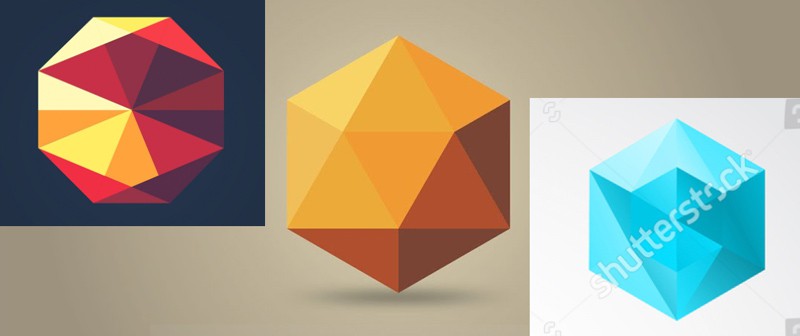
I started looking for a design with basic shapes. But it needed an edge, something equally modern and timeless. My attention turned to low poly graphics. They are so simple yet have something so mesmerizing about them.
Instead just the two colours, electric blue and orange, the approach offered an appetizing palette of variants thereof. I started playing around with these colours and shapes, and quickly found the triangles in the design had to follow certain rules in order to look appealing. I came up with a few suggestions employing these principles.
Low Poly Approach
That’s when the board produced this mock-up. It still looked very basic but gave a clear guidance, making it obvious that they wanted something resembling the old kit V.01 pretty closely.
Lead Mock-up

The Solution
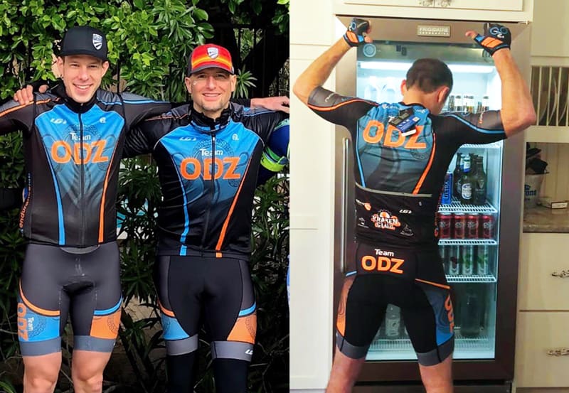
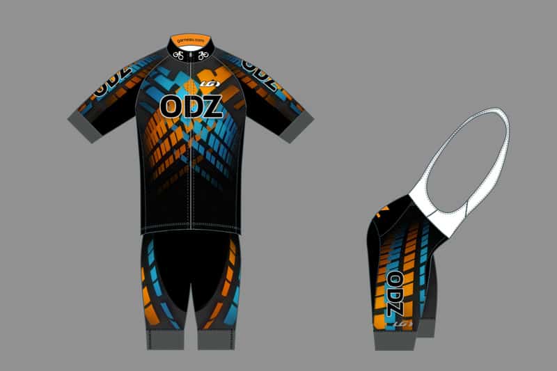
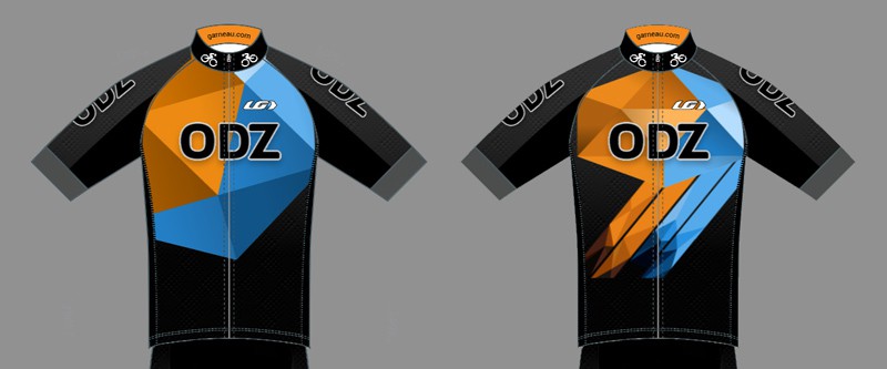
Based on the distinct layout of the provided mock-up I started developing what would become the new design V. 3.0. The direction did not really allow for the design to follow the anatomy of the rider with dynamic lines, but I could still put the low poly design into play, and taper out the stripes on the black background without the use of gradients. I created a two vector designs of strips and arranged composed them together on top of a black background. Except the background is actually not all black but transforms into dark grey from center to top, giving the wearer a better shape.
2021
Final Kit Design

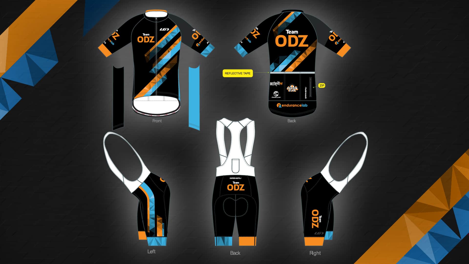

The client loved it! – Print production of the kit followed suit. Including an adaptation of the kit to a T-shirt design (not pictured).

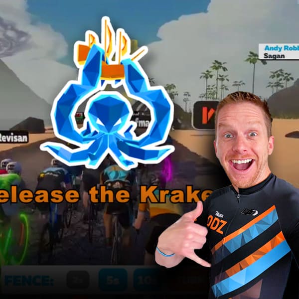
With this approval, the very next step was to update the background images for the website and the live streams. The latter had always been a still image. I delivered a few versions for the client to pick one. Once that was in the bag, I created an unobtrusive 15 sec video loop of the design. The use of this animated background has given the live streams so much more life and depth, in a subliminal fashion.
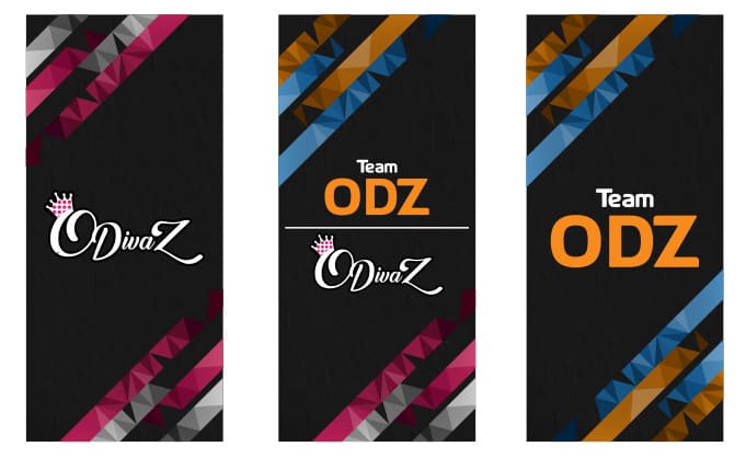
Then followed the website elements. With a bit of extra help from the team the social media page headers were created, as well as phone wallpapers for all the enthusiasts!
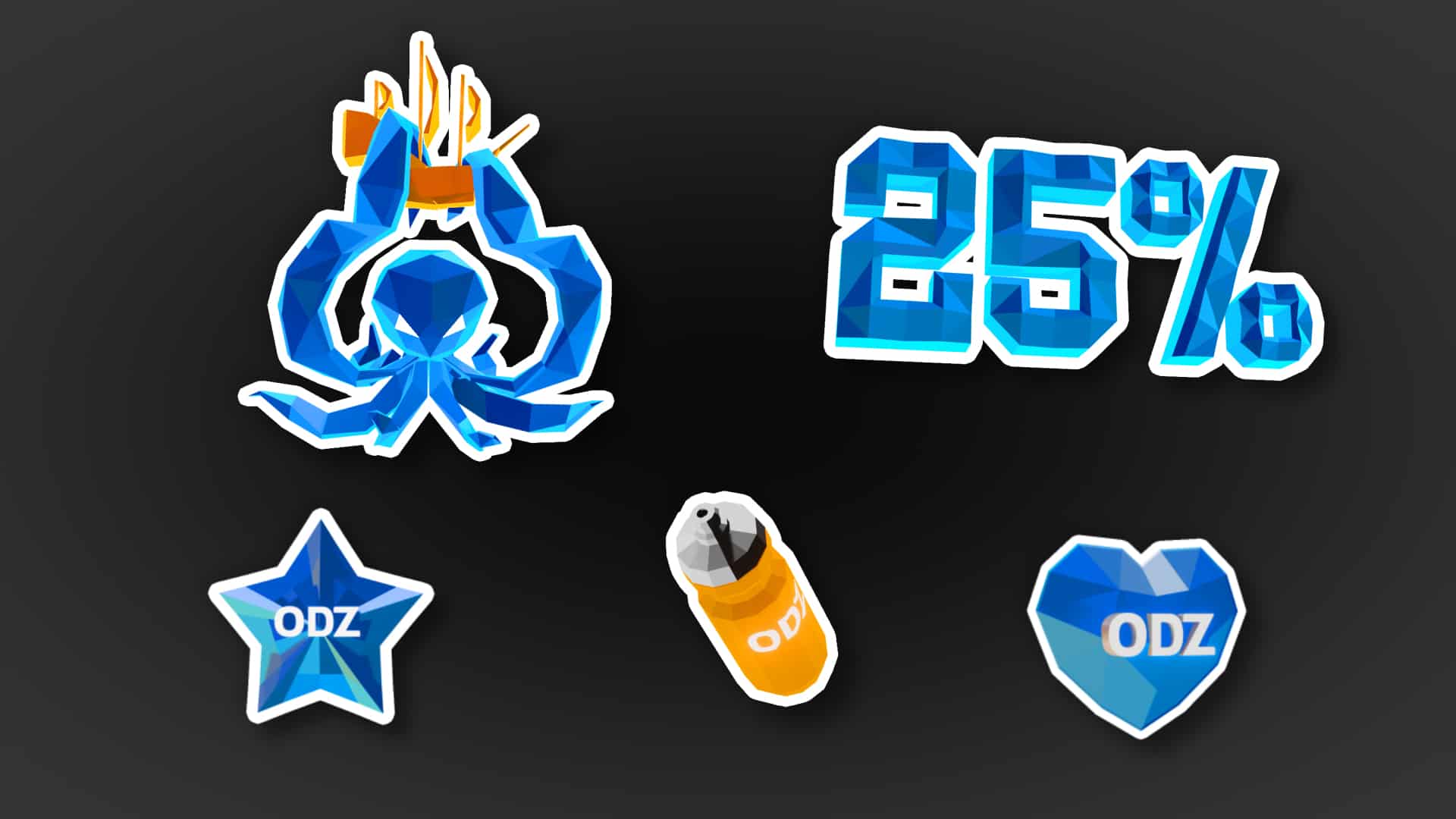
The team had been using stock animations and images for channel likes and subs notifications for Facebook and Twitch during live streams. Furthermore, Twitch also offered point rewards. This offered the chance for much better branding by using custom animations in the established low poly style: They were front and center and played back several times during a stream, on average.
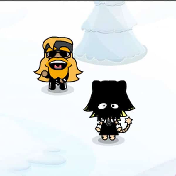
Last but not least, the graphics from the notifications and alerts offered themselves for custom Twitch emotes for use in the lively chat during daily rides and races.
Screen Design
All in all a very rewarding project: Being in charge of multiple disciplines is always great, and I was granted a lot of creative freedom. Last but not least, the ODZ crew was very appreciative!